To define how HTML element is rendered on screen or other media, there is a cascading style sheet language, or CSS for short. With CSS you can change the UI look (and feel, to the certain extent). Let’s start from CSS Basics.
This guide does not pretend to be an ultimate reference documentation for CSS. Full specification would deserve a book. For a quick reference, MDN Web Docs is a good start (including HTML and JavaScript documentation).
Styling HTML Elements
Stylesheet is a text containing rules. Each rule consists of the element selector that defines the elements to style and a set of declarations, each one is property name and its value. For example:
p {
    color: red;
}
With this rule, we apply value “red” to property “color” for each <p> tag.
Stylesheets are written either inside of <style> tag of HTML file or loaded from external text file with .css extension via HTML’s <link> tag. Whether inline or external, multiple stylesheets processed in the order they appear in HTML file. That is cascading in CSS abbreviation.
You can also apply styles to particular HTML element via its style attribute.
Document Tree
Consider the following HTML:
<html>
  <head>
    <title>Lorem ipsum</title>
  </head>
  <body>
    <section>
      <h1>Section 1</h1>
      <p>Lorem ipsum dolor sit amet, consectetur adipiscing elit</p>
      <p>sed do eiusmod tempor incididunt ut labore et dolore magna aliqua</p>
    </section>
    <section>
      <h1>Section 2</h1>
      <p>Ut enim ad minim veniam, quis nostrud exercitation</p>
      <p>ullamco laboris nisi ut aliquip ex ea commodo consequat</p>
    </section>
  </body>
</html>
While loading the browser transforms it into the tree-like structure with the root on top, growing down:
html
├ head
│ └ title
└ body
  ├ section
  │ ├ p
  │ └ p
  └ section
    ├ p
    └ p
P tags are children (placed one level down) of the section tag and descendants (placed anywhere down) of the body and section. Section is the parent for p tags. Section and Body are ancestors of p. HTML tag is a root of the tree.
Selectors
Selectors identify HTML elements to apply the rules to.
How CSS identifies HTML elements? Either via tag name, or by presence of by its class, or by its id, or by any combination of these three. Consider:
<p id="myid" class="myclass1 myclass2" myattribute="value">Some text</p>p— type selector, selects any element with tag name p.myclass1— class selector, selects any element containing word myclass1 in their class attribute.#myid— id selector, selects an element having id attribute’s value myid.[myattribute="value"]— attribute selector, selects elements having attribute myattribute equal to value[myattribute]— another form of attribute selector, selects elements having an attribute named myattribute, regardless of value.
Writing multiple id/tag/class/attribute selectors with no space between them means the element should match ALL the conditions.
p.myclass1#myid[myattribute="value"] denotes the element with tag name p AND class myclass1 AND id myid1 AND myattribute equals to value. The order of selectors does not matter, p]#myid[myattribute="value".myclass1 is identical selector.
If you need to apply the same set of properties to multiple elements that can not be covered with single selector, list individual selectors separating them by comma. This is called list combinator. And remember, you are free to specify multiple declarations per rule:
.alert, .error {
    color: white;
    background-color: red;
    border: solid 1px black;
}
There are more combinators, if you need to address an element related to another element.
- ” ” (space) – the descendant combinator.
div p { ... }applies to a p tag that resides anywhere inside div tag. - > (right angle bracket): the child combinator.
div > p { ... }applies to a p tag that is immediate child of div - + (plus sign): the next-sibling combinator.
h1 + p { ... }applies to p tag standing next to h1 tag. - ~ (tilde): – subsequent-sibling combinator.
h1 ~ p { ... }applies to p tag that follow (but not necessary stands next) to h1 tag.
Rule priority
When it comes to rendering HTML element, the browser scans all the loaded stylesheets, finds all the rules with selectors matching the element, combines all their declarations and applies styling to the element. But what if there are multiple declarations of the same property? Consider:
<style>
.alert { color: red; }
div { color: black; background-color: white; }
</style>

<div class="alert">Alert!</div>
What would be the color of the text, red or black?
Here comes selector specificity. You can think of it as a three-digit number. Count IDs, classes and tag names in your selector. Each ID adds 100, each class/attribute adds 10 and each tag name adds 1 to the result. The bigger the resulting number, the more priority the rule has.
In the example above, .alert { ... } has a specificity of 010 and div { ... } has a specificity of 001, thus .alert {} rule wins and the color of the text will be red. Between the rules of the same specificity latest one wins:
<style>
/* specificity: 010 */
.red { color: red; }
/* specificity: 010 */
.alert { color: yellow; }
</style>

<div class="alert red">Yellow</div>
Styles applied directly to the element have even more priority than any style defined in the stylesheet
<div class="red" style="color:yellow">Yellow</div>You can raise the priority of stylesheet declaration with !important keyword added to the end of the value:
<style>
#green {
    /* selector specificity: 100 */
    color: green;
}

.yellow {
    /* selector standard specificity: 010 */
    /* but due to !important, color declaration wins */
    color: yellow !important;
}
</style>

<div id="green" class="yellow">Yellow</div>
Inherited Properties
Inheritance means the property set on the ancestor element is used by all of its descendants unless overridden. Text color and font properties are inheritable. You do not need to specify it for every element, just set it on top-level html or body level.
Dimensions
Each HTML element on the page is represented as a rectangular box, consisting of several layers: content, padding, border, and margin.
- Content: This is where the content of the element (text, images, etc.) is displayed.
- Padding: Padding is the space between the content and the border. It can be set using the padding property, which can control all sides at once or individually using padding-top, padding-right, padding-bottom, and padding-left.
- Border: The border surrounds the padding and content. The border’s thickness, style, and color can be set using the border property or individually using border-width, border-style, and border-color.
- Margin: The margin is the outermost layer, creating space between the element and other elements. It can be set using the margin property or individually using margin-top, margin-right, margin-bottom, and margin-left.
To change the size of the box you can use width and height properties. There are two sizing models you can switch using box-sizing property.
Standard model or content-box sizing assumes width and height properties apply to content box. To calculate effective element’s size, you should add paddings and border’s size to the dimensions you’ve specified.
Alternative model, or border-box sizing assumes width and height applied to border box. To calculate the width of the content box you should subtract paddings and border size from the dimensions you’ve specified.
Dimension values are specified together with unit of measurement. Most commonly used:
- px – virtual pixel, 1/96 of inch.
- em – font size of the element. 2em means two times the size of the current font.
- % – size of the parent element.
- rem – font size of the root element (HTML tag).
- vw – 1% of the width of the browser window (viewport’s width). 100vw means full width;
- vh – 1% of the height of the browser window (viewport’s height). 100vh means full height;
Shorthand properties
As some properties often set together, they have shorthand variants allowing to set multiple properties at once.
.bordered {
   border-style: solid;
   border-width: 1px;
   border-color: black;
}

/* or using shorthand */
.bordered {
   border: solid 1px black;
}

/* Another example */
.m1234 {
   margin-top: 1px;
   margin-right: 2px;
   margin-bottom: 3px;
   margin-left: 4px;
}

/* or using shorthand */
.m1234 {
    /* order matters: top right bottom left */
    margin: 1px 2px 3px 4px;
}
Colors
In CSS you can specify the color either by name, using the palette of 256 standard named colors, or by specifying numerical values in range between 0 and 255 for color’s red, green and blue component.
Historically, they are written as sharp sign followed by hexadecimal form of red, green and blue components. With growing support for colors, support for semi-transparent colors in particular, browsers added new notations to accommodate new features.
One that is easy to remember is rgb() function with space separated decimal numbers for red, green and blue components. To specify transparency, add a slash and a floating-point number between 0 (fully transparent) and 1 (fully opaque).
You can play with the color pickers to check the notations for various color values. Squares on the right render selected color. Top square paints semi-transparent colors on white background, while bottom square paints on black background.
| Red: | ||
| Green: | ||
| Blue: | ||
| Opacity: | ||
Another interesting color model is HSL, that stands for Hue, Saturation, Lightness. Hue is a degree on the color wheel, Saturation is a percentage value from 0% (completely gray) to 100% (full color) and Lightness is another percentage value varying from 0% (no light, black) to 100% (full light, white)
| Hue: | |||
| Saturation: | |||
| Lightness: | |||
| Opacity: |
You can play with the color pickers above to check the notations for various color values. Squares on the right render selected color. Top square paints semi-transparent colors on white background, while bottom square paints on black background.
Producing lighter or darker shade of the color in RGB model require playing with semi-transparency over black or white overlay. In contrast, in HSL model making the color lighter or darker is simply an adjustment of Lightness component of the color.
Custom Properties (variables)
Custom property names start with double dash and inherit their value from ancestor element. To access the value of custom property, use var() function. Custom properties are particularly useful with various customization techniques.
Let’s see it in action. Suppose you have page layout where header and footer and some other elements are colored with alternate color, say, gray, styled with:
.header, .footer /*, more selectors */ {
    color: gray;
}
Now, if you want to change the alternate color from gray to light gray in every element you have to replicate original selector.
.header, .footer /*, more selectors */ {
    color: lightgray;
}
With custom properties you can define the color once on the top level, typically on HTML element and use it anywhere down the element tree:
html {
    --alternate-color: gray
}

.header, .footer /*, more selectors */ {
    color: var(--alternate-color);
}
and to change the color, simply redefine the custom property value in your CSS:
html {
   --alternate-color: lightgray;
}
Using second argument to var() function you can provide default value for the case custom property is not set.
.header, .footer /*, more selectors */ {
    color: var(--alternate-color, gray);
}
Functions
Functions allow you to perform some arithmetic calculations within the stylesheet.
calc(expression)calculates arithmetic expressionmin(value1, value2, ...valueN)selects smallest from supplied valuesmax(value1, value2, ...valueN)selects greatest from supplied valuesclamp(min, middle, max)puts adjust the middle value to fit into min..max range
Combined with custom properties functions you can create powerful tools:
.form {
   /* lay out forms in 4 columns */
   --form-columns: 4;
}

.form-cell {
   /* the cell takes 1/Nth of form's width but can not shrink less than 250px */
   width: max(250px, calc(100% / var(--form-columns, 1)));
}

#myform.form {
   /* lay out #myform in 2 columns */
   --form-columns: 2;
}
Browser Development Tools
Each desktop browser is packed with a set of development tools (devtools for short). Here we’ll refer to those from Chrome browser, yet their functionality and layout is more or less the same in all browsers.
How to pull it up? You have multiple ways:
- Keyboard
- Windows: Ctrl+Shift+I or F12
- Mac: Cmd+Option+I
- Menu bar
- Firefox: More tools | Web Developer Tools
- Chrome: More tools | Developer tools
- Safari: Develop (this menu item should be first enabled in Safari Settings) | Show Web Inspector.
- Context menu
- Press-and-hold/right-click an item on a webpage (Ctrl-click on the Mac), and choose Inspect Element from the context menu that appears. (An added bonus: this method straight-away highlights the code of the element you right-clicked.)
Development Tools window will appear. From there you can debug JavaScript code, check network traffic and what not, but we’ll concentrate on HTML Elements and stylesheets.
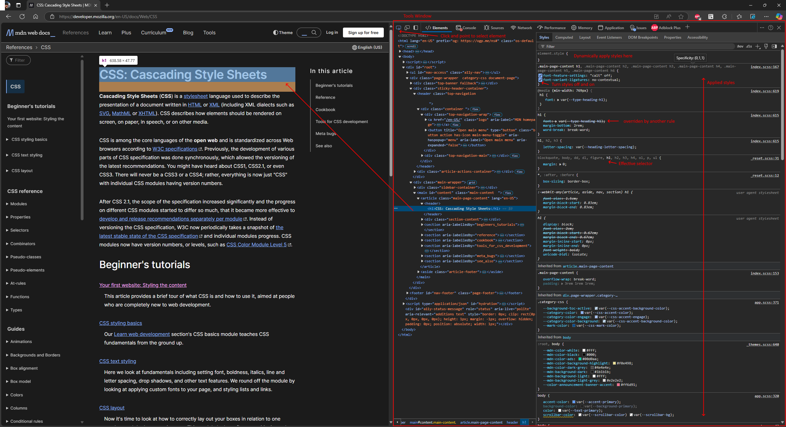
Elements tab of the Development Tools window displays an HTML element tree on the left pane. You can select the element from the tree or use point-and-click tool to select the element on the page. Right pane of the Elements tab is an element inspector, and here we’ll be interested in first two tabs: Styles and Computed.
Styles tab lists rules to apply to the selected element, listed in the order of selector specificity. Moreover, it allows dynamic style modifications. You can turn individual declarations on and off, write your own styles and rules. Changes you make on the Styles tab immediately reflected on the page but obviously won’t be saved back to the source.
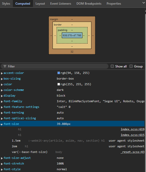
While Styles tab displays the information from rule perspective, Computed tab does it from property perspective. It displays element’s box model values as well as lists the properties affected by current styles on various levels. Expanding the property would provide you the list of rules setting this property value.
That’s all for today. Coming up next practical styling for new TeamDesk UI.
Stay tuned!