In old TeamDesk UI in order to lower the amount of data transferred we marked page elements sparsely, rather relying on complex styling. When we added custom styling capabilities this approach started to pose the problem.
This article discusses customizing TeamDesk appearance using cascading stylesheets (CSS). If you are not familiar with CSS, feel free to read our Styling new TeamDesk UI, part 1: CSS Basics blog article.
In order to override the style, you had to replicate the same complex selector to match the specificity of original one.
Reused style parameters like border radius were spread all over our stylesheet. We had a little problem with it since we were using CSS preprocessor supporting variables but if you wanted to give interface rectangular look you would need to override few dozen styles. Styles based on custom-defined colors were applied right onto the HTML elements.
Aligning elements to the left and right edge of container element (header to the left, buttons to the right for example) were implemented via element’s floating which is counter-intuitive in this case.
In new UI we tried to address these and many other shortcomings.
- We added class names to every element we style.
- We brought class names into the easy-to-remember system.
- Most of the styling can be done applying to single class name.
- We use font-size-relative units extensively.
- We use CSS custom properties (also known as CSS variables) to style commonly used parameters.
- We extensively use Flexbox layout to align elements.
- Since new interface uses lighter color scheme, we extensively manipulate with colors defined for elements via database setup section.
Let’s dive into new styling.
Class naming common convention
Since new styling is a radical departure from old one, when new UI is in use we plug separate CSS file, dbstyles-v3.css in.
HTML on the page is typically organized into logical blocks (header, tabs, sidebar, footer). Those blocks consist of other HTML elements, indivisible from parent block. Blocks or elements may change their appearance based on some conditions.
To markup such a structure, BEM (block-element-modifier) naming convention is the best choice. In BEM first goes block name. If block consists of indivisible elements, for each element goes double underscore as a separator, then element name. Finally, class name is optionally suffixed with double dash and modifier’s name.
And to distinguish between old and new UI all new classes have v3- prefix. Let’s see how it works on, say, tabs.
Semantically, tab bar is an unordered list of links. Styled, it’s a strip of cells, each cell holding an item (link). One of the items can be active.
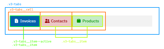
v3-tabs class rules set flexbox layout. v3-tabs__cell сlass rules define the size of the cell. v3-tabs__item define the look of the tab, while v3-tabs__item–active rules override active tabs text and background colors. A sort of:
.v3-tabs {
    display: flex;
}
.v3-tabs__cell {
    flex: 0 0 auto;
}
.v3-tabs__item {
    color: red;
    background-color: lightred;
}
.v3-tabs__item--active {
    color: white;
    background-color: red;
}
Clean and simple.
Rarely, multiple classes still used in combination, but these are typically pinpoint changes to the styling depending on the context.
Relative units
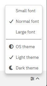
We extensively use relative units, em or rem for elements’ sizing. To refresh, em is a size of capital Latin letter M rendered with current font. Rem (root em) is a size of capital Latin letter M rendered with font defined at root (HTML element) level. Using ems and rems allow us to easily achieve scaling effect: bigger the root font, bigger are elements’ paddings and margins.
Our old UI had fairly large CSS block to handle “dense” version of the interface. With relative units, new UI simply scales the font on HTML level. Font selector does nothing more than setting font size to 12px, 14px and 16px for small, normal and large font.
Custom Properties
Using custom properties allows us to share the value between components that has no direct connection to each other, concentrate common parameters at block level or simplify styling by calculating styles based on a single property value. As custom properties are inherited down HTML elements’ tree, it’s also useful to provide defaults at tree’s root level and override values at certain contexts. For example, we are defining uniform border radius via –v3-border-radius custom property at root level. This radius value is used by tabs, buttons, input controls, sidebar and what not. If you want to give buttons rectangular look, you simply set new radius value for all buttons.
:root {
    --v3-border-radius: 6px;
}

.v3-button {
    --v3-border-radius: 0px;
}
Custom property names start with double dash (by CSS convention). Following common convention, we also added v3- prefix for our variables. Properties, prefixed with –-v3-sys- are either set by JavaScript code or used to hold intermediate calculation results and not intended for modification.
Colors common conventions and calculation
Color manipulation is a most interesting part of the new UI. TeamDesk setup section allows specifying colors for tables/tabs, views, buttons, form sections and many more. Old UI mainly used colors specified by the user as is. Due to different colorization scheme in new UI, we take user-specified color as a basis and producing a set of new colors by manipulating selected color’s darkness/brightness. This is done using HSL color scheme and CSS mathematical functions.
“Classic” method of specifying the color is to provide a triplet of red, green and blue channels’ brightness levels, called RGB color scheme. HSL color scheme uses different approach. It specifies hue as a degree (0-360) on a color wheel, saturation in percentage from gray to pure color and lightness, in percentage, from black to white. While changing color lightness in RGB requires multiplication of each component proportionally, in HSL you simply need to adjust L component. But how?
CSS Color support is developing, and modern browser have a lot of color related functionality implemented, such as relative colors. But while some old hardware such as Apple iPhone 6s or iPad Air 2 receive no new feature updates it still gets security updates and perfectly usable. As we do not want to drop these devices support, we have to resort to good old basic math. You are free to set your own browsers’ baseline, just do not forget to check compatibility tables.
If we specify colors as three custom properties holding numeric value of H, S and L components, then we can construct real color and derived colors using basic math operations. Schematically it is:
.button {
   /* back color components, unitless */
   --back-h: 206;
   --back-s: 100;
   --back-l: 34;

   /* construct color value from components */
   background-color: hsl(var(--back-h), calc(1% * var(--back-s)), calc(1% * var(--back-l));
   /* choose white/black text color based on background's lightness */
   color: hsl(0, 0%, calc(100% * (50 - var(--back-l)));
}

.button:hover {
   /* for hover state, construct color value from components making background lighter */
   background-color: hsl(var(--back-h), calc(1% * var(--back-s)), calc(1% * (var(--back-l) + 20));
}
What we do here? We specify button’s background color as three properties each holding corresponding color component in HSL color space. To simplify color manipulation all three are integer numbers, unitless.
Then we construct color value from these components. Hue component needs no unit as long as value specified in degrees. To convert integer number to percentage we multiply the value by 1% and wrap math expression with calc() function. This way we specify saturation and lightness components.
For hover state we specify background color the same way, but adding 20 to lightness components.
Determining text color another simple trick — we subtract background’s lightness from midpoint (50). For colors lighter than 50 the result of subtracting will be negative. For colors darker than 50 the result will be positive. Assuming the value is integer and multiplying the result by 100% we have either negative or zero lightness value which is interpreted as black or lightness greater than or equal to 100% which is interpreted as white.
Let’s make a cheat sheet with common expressions that might be useful in color construction.
/* Construct color value from components */
--color: hsl(var(--color-h), calc(1% * var(--color-s)), calc(1% * var(--color-l)));
/* Determine color is dark or light (dark: 0, light: 1) */
--color-light: max(0, min(var(--color-l) - 50), 1);
/* Determine color is dark or light (dark: 1, light: 0) */
--color-dark: max(0, min(50 - var(--color-l)), 1);
/* Inverting 0/1 to 1/0 */
--color-dark: calc(1 - var(--color-light));
/* If back color is light choose dark gray, else light gray */
--text-color-l: calc(var(--color-light) * 10 + (1 - var(--color-light)) * 90);
Our stylesheet uses these tricks in various combinations, but nothing more complex.
Ok, enough for today.
In the next article — documenting root level global variables, typography and color palette.