As CSS custom properties defined at the root level of HTML element tree are available to all the descendants, we set many properties there. They either define whole page appearance or act as the defaults from frequently used components. These properties can be divided into three large sets: typography, palette and appearance.
Typography
This is all about page’s fonts. We use two font faces: monospace, one where all letters and digits have the same width, to render preformatted elements in markup and another to render everything else. In new TeamDesk UI we use IBM Plex Mono for monospaced font and IBM Plex Sans as main font. There are two custom properties for this:
:root {
    --v3-font-face: "IBM Plex Sans";
    --v3-monospace-font-face: "IBM Plex Mono";
}
Please remember to put font face in quotes if it contains spaces.
Browser downloads these fonts and there is always a risk of network failure. For this case we provide a list of fallback fonts — those that can be used, in order of preference, and likely preinstalled with your operating system. So, there is another pair of variables to concatenate primary font with a list of fallback fonts. Fallback font list provided there is pretty much standard in web development, so these is a little need to change these two.
:root {
    /* fallback font list is shortened ... for readability */
    --v3-font-family: var(--v3-font-face), -apple-system, BlinkMacSystemFont, "Segoe UI", Roboto, ..., sans-serif;
    --v3-monospace-font-family: var(--v3-monospace-font-face), SFMono-Regular, Menlo, ..., monospace;
}
If you, say, like Google’s Material design and want to use Roboto as a primary font, it’s won’t be hard:
/* dbstyles-v3.css */
/* import Roboto font from Google Fonts */
@import "https://fonts.googleapis.com/css2?family=Roboto:ital,wght@0,100..900;1,100..900&display=swap";

/* import Roboto Mono font from Google Fonts */
@import "https://fonts.googleapis.com/css2?family=Roboto+Mono:ital,wght@0,100..700;1,100..700&family=Roboto:ital,wght@0,100..900;1,100..900&display=swap";

/* Set the variables */
:root {
    --v3-font-face: "Roboto";
    --v3-monospace-font-face: "Roboto Mono";
}
Ok, we got the font, but what about the size? There is another property for this. Well, in fact, three.
New UI features “quick settings” menu located at the footer of the page to control color theme (dark, light or system-defined) and font size (small, normal or large). So, we have three properties:
:root {
    /* normal is 14px by default */
    --v3-font-pref-normal: 14px;
    /* small is 2px smaller than normal */
    --v3-font-pref-small: calc(var(--v3-font-pref-normal) - 2px);
    /* large is 2px larger than normal */
    --v3-font-pref-large: calc(var(--v3-font-pref-normal) + 2px);
}
As you see from the code, you can, but you do not need to adjust all three — changing the value of –v3-font-pref-normal will automatically calculate small and large variations for you. And setting –v3-font-pref-small and –v3-font-pref-large to the same value disables font size picker in quick settings.
There is no separate property for monospace font as preformatted elements can be placed in line with normal elements, thus monospaced font size matches main font size. But there are properties to control the size of the font in headers and small font.
These properties provide the size relative to main font size using rem units.
:root {
    --v3-h1-font-size: 2.25rem;
    --v3-h2-font-size: 2rem;
    --v3-h3-font-size: 1.75rem;
    --v3-h4-font-size: 1.5rem;
    --v3-h5-font-size: 1.25rem;
    --v3-h6-font-size: 1rem;
    --v3-small-font-size: 0.85rem;
}
H1-H6 values apply to corresponding HTML tags and are reference values used as-is on large screens. On small screens these value decrease — smaller the screen, smaller the font. –v3-small-font-size is a reference value applied selectively where we need smaller font, like footer or record-level buttons inside views and forms.
And finally there are two more font-size-related properties: font size for input boxes and buttons.
:root {
    --v3-input-font-size: inherit;
    --v3-button-font-size: inherit;
}
By default, in both cases we inherit inputs’ and button’s font size from its surroundings. Yet, iPhones are known to automatically zoom the page when input control gets focus, and its font size is less than 16px. So, for iPhones we redefine font size to 16px to avoid unnecessary zooms.
Palette’s root properties
New UI element colors are based on a palette of four colors: Primary Background Color, Primary Text Color, Secondary Background Color and Secondary Text Color. These four colors used in combination: Primary Text/Background for main content, Secondary Text on Primary Background for non-essential content, Primary or Secondary Text on Secondary Background for non-essential elements. You do not need to set all four: based on primary background color components we calculate the rest. Though you can always override calculated colors if you are not satisfied with the result. These palette colors are defined via individual values of hue (H), saturation (S) and luminosity (L) components, with color value calculated from H, S, L triplet. In fact, this approach is quite powerful:
:root {
    /* pure white */
    --v3-primary-back-color-h: 0;
    --v3-primary-back-color-s: 0;
    --v3-primary-back-color-l: 100;

    /* calculates color value, no need to override */
    --v3-primary-back-color: hsl(var(--v3-primary-back-color-h), calc(1% * var(--v3-primary-back-color-s)), calc(1% * var(--v3-primary-back-color-l)));

    /* helper value, direction: 1 - light, -1 - dark */
    --v3-sys-primary-back-color--lightdark: calc(2 * min(max(0, var(--v3-primary-back-color-l) - 50), 1) - 1);
}
In fact, this approach is quite powerful. Our dark theme only redefines primary color.
:root[data-preference-colortheme=dark] {
    /* very dark bluish-gray */
    --v3-primary-back-color-h: 203;
    --v3-primary-back-color-s: 29;
    --v3-primary-back-color-l: 12;
}
Secondary background color by default is calculated as 5% darker/lighter shade of primary background color, depending on primary background color’s lightness.
:root {
    /* hue and saturation match primary background color */
    --v3-secondary-back-color-h: var(--v3-primary-back-color-h);
    --v3-secondary-back-color-s: var(--v3-primary-back-color-s);

    /* lightness is ±5% ligher/darker */
    --v3-secondary-back-color-l: calc(var(--v3-primary-back-color-l) - 5 * var(--v3-sys-primary-back-color--lightdark));

    /* calculates color value, no need to override */
    --v3-secondary-back-color: hsl(var(--v3-secondary-back-color-h), calc(1% * var(--v3-secondary-back-color-s)), calc(1% * var(--v3-secondary-back-color-l)));
}
Similar logic applies to primary and secondary text. Primary text keeps primary background color’s hue and saturation and sets lightness at 15% for light backgrounds and 95% for dark backgrounds.
:root {
    /* hue and saturation match primary background color */
    --v3-primary-text-color-h: var(--v3-primary-back-color-h);
    --v3-primary-text-color-s: var(--v3-primary-back-color-s);

    /* lightness is set at 15%/95% */
    --v3-primary-text-color-l: calc(55 - 40 * var(--v3-sys-primary-back-color--lightdark));

    /* calculates color value, no need to override */
    --v3-primary-text-color: hsl(var(--v3-primary-text-color-h), calc(1% * var(--v3-primary-text-color-s)), calc(1% * var(--v3-primary-text-color-l)));
}
And for secondary text:
:root {
     /* hue and saturation match secondary background color */
    --v3-secondary-text-color-h: var(--v3-secondary-back-color-h);
    --v3-secondary-text-color-s: var(--v3-secondary-back-color-s);

    /* lightness is ±20% ligher/darker than primary text */
    --v3-secondary-text-color-l: calc(var(--v3-primary-text-color-l) + 20 * var(--v3-sys-primary-back-color--lightdark));

    /* calculates color value, no need to override */
    --v3-secondary-text-color: hsl(var(--v3-secondary-text-color-h), calc(1% * var(--v3-secondary-text-color-s)), calc(1% * var(--v3-secondary-text-color-l)));
}
For your convenience, we have a set of properties to define palette of colors. You can reference either color components or a color value as a whole. All palette properties named –v3-palette-name-color:
:root {
    /* Hue, saturation and lightness of palette color */
    --v3-palette-blue-color-h: 208;
    --v3-palette-blue-color-s: 100;
    --v3-palette-blue-color-l: 44;
    /* calculates color value, no need to override */
    --v3-palette-blue-color: hsl(var(--v3-palette-blue-color-h), calc(1% * var(--v3-palette-blue-color-s)), calc(1% * var(--v3-palette-blue-color-l)));
}
Valid color names are: red, orange, yellow, green, teal, blue, navy, violet, purple, pink, black, white, gray.
One color property set is generated directly on HTML element, in its style attribute, for example
/* Hue, saturation and lightness of current table's color */
--v3-current-table-hint-color-h: 206;
--v3-current-table-hint-color-s: 100;
--v3-current-table-hint-color-l: 34;
/* Hue, saturation and lightness of current table's color */
--v3-current-table-hint-color: hsl(206,100%,34%);
You can use refer to them to color various elements on the page according to table’s color.
Additional Properties
We never set an aim to control every aspect of the styling via custom properties. Yet we wanted to simplify styling of common aspects. How input controls are colored? Should elements have rounded or square corners? How wide is a sidebar?
In addition, root level defines properties to control various appearance aspects. We have not set an aim to control every aspect of styling via properties, rather commonly used ones. Sharp or rounded corners? Bordered or borderless inputs? Width of the sidebar? Link color?
:root {
    /* Default animation time, set to 0ms to disable */
    --v3-transition-time: 300ms;

    /* Default border radius. Set to 0px for rectangular shapes */
    --v3-border-radius: 6px;

    /* Link text color in normal and hover state. default is current color of the text */
    --v3-link-text-color: currentColor;
    --v3-link-text-color--hover: currentColor;

    /* Accent color. Used for focus ring, default buttons, radio buttons and checkboxes. Defaults to palette blue color */
    --v3-accent-color-h: var(--v3-palette-blue-color-h);
    --v3-accent-color-s: var(--v3-palette-blue-color-s);
    --v3-accent-color-l: var(--v3-palette-blue-color-l);

    /* Page body background and text colors */
    --v3-body-back-color: var(--v3-primary-back-color);
    --v3-body-text-color: var(--v3-primary-text-color);

    /* Sidebar width */
    --v3-sidebar-width: 256px;

    /* Focus outline, defaults to accent color, 50% transparent */
    --v3-focus-outline-color: hsl(var(--v3-accent-color-h), calc(1% * var(--v3-accent-color-s)), calc(1% * var(--v3-accent-color-l)), 50%)
    /* Focus outline, complete box-shadow effect */
    --v3-focus-outline: 0 0 0 2px var(--v3-focus-outline-color);
}
The following set of properties helps with default styling of input controls:
:root {
    /* Use font size of the container */
    --v3-input-font-size: inherit;
    /* defaults to --v3-border-color property */
    --v3-input-border-color: var(--v3-border-color);
    /* inputs are bordered by default. set to 0px for borderless */
    --v3-input-border-width: 1px;
    /* input's corner radius. set to 0px for rectangular shape */
    --v3-input-border-radius: var(--v3-border-radius);
    /* Text color, defaults to primary text */
    --v3-input-text-color: var(--v3-primary-text-color);
    /* Background color, defaults to primary background */
    --v3-input-back-color: var(--v3-primary-back-color);
    /* Text color of disabled control, defaults to secondary text */
    --v3-input-text-color--disabled: var(--v3-secondary-text-color);
    /* Back color of disabled control, defaults to secondary background */
    --v3-input-back-color--disabled: var(--v3-secondary-back-color);
    /* Color of the required mark (left border), defaults to palette red */
    --v3-input-required-color: var(--v3-palette-red-color);
    /* Color of the invalid input mark, defaults required setting */
    --v3-input-invalid-color: var(--v3-input-required-color);
    /* Color of the placeholder, defaults to secondary text */
    --v3-input-text-color--placeholder: var(--v3-secondary-text-color);
}
And there is another set to style buttons:
:root {
    /* Use font size of the container */
    --v3-button-font-size: inherit;
    /* defaults to --v3-border-color property */
    --v3-button-border-color: var(--v3-border-color);
    /* buttons are borderless by default. */
    --v3-button-border-width: 0px;
    /* button's corner radius. set to 0px for rectangular shape */
    --v3-button-border-radius: var(--v3-border-radius);
    /* button's back color, as HSL triplet, default to secondary background */
    --v3-button-back-color-h: var(--v3-secondary-back-color-h);
    --v3-button-back-color-s: var(--v3-secondary-back-color-s);
    --v3-button-back-color-l: var(--v3-secondary-back-color-l);
    /* calculates color value, no need to override */
    --v3-button-back-color: hsl(var(--v3-button-back-color-h), calc(1% * var(--v3-button-back-color-s)), calc(1% * var(--v3-button-back-color-l)));
    /* default button's back color, as HSL triplet, default to accent color */
    --v3-button-default-back-color-h: var(--v3-accent-color-h);
    --v3-button-default-back-color-s: var(--v3-accent-color-s);
    --v3-button-default-back-color-l: var(--v3-accent-color-l);
    /* calculates color value, no need to override */
    --v3-button-default-back-color: hsl(var(--v3-button-default-back-color-h), calc(1% * var(--v3-button-default-back-color-s)), calc(1% * var(--v3-button-default-back-color-l)));    /* Text color of disabled button, defaults to secondary text */
    --v3-button-text-color--disabled: var(--v3-secondary-text-color);
    /* Back color of disabled control, defaults to secondary background */
    --v3-button-back-color--disabled: var(--v3-secondary-back-color);
}
Button’s text color property is deliberately missing. As button’s background can be also set via TeamDesk settings to arbitrary color, the only reliable value for text color to provide button’s uniform look is black or white. So, button styles check for background color’s lightness and apply text color accordingly.
Theme Editor
To save you from coding the styles, we created simple, three-pane Theme Editor.
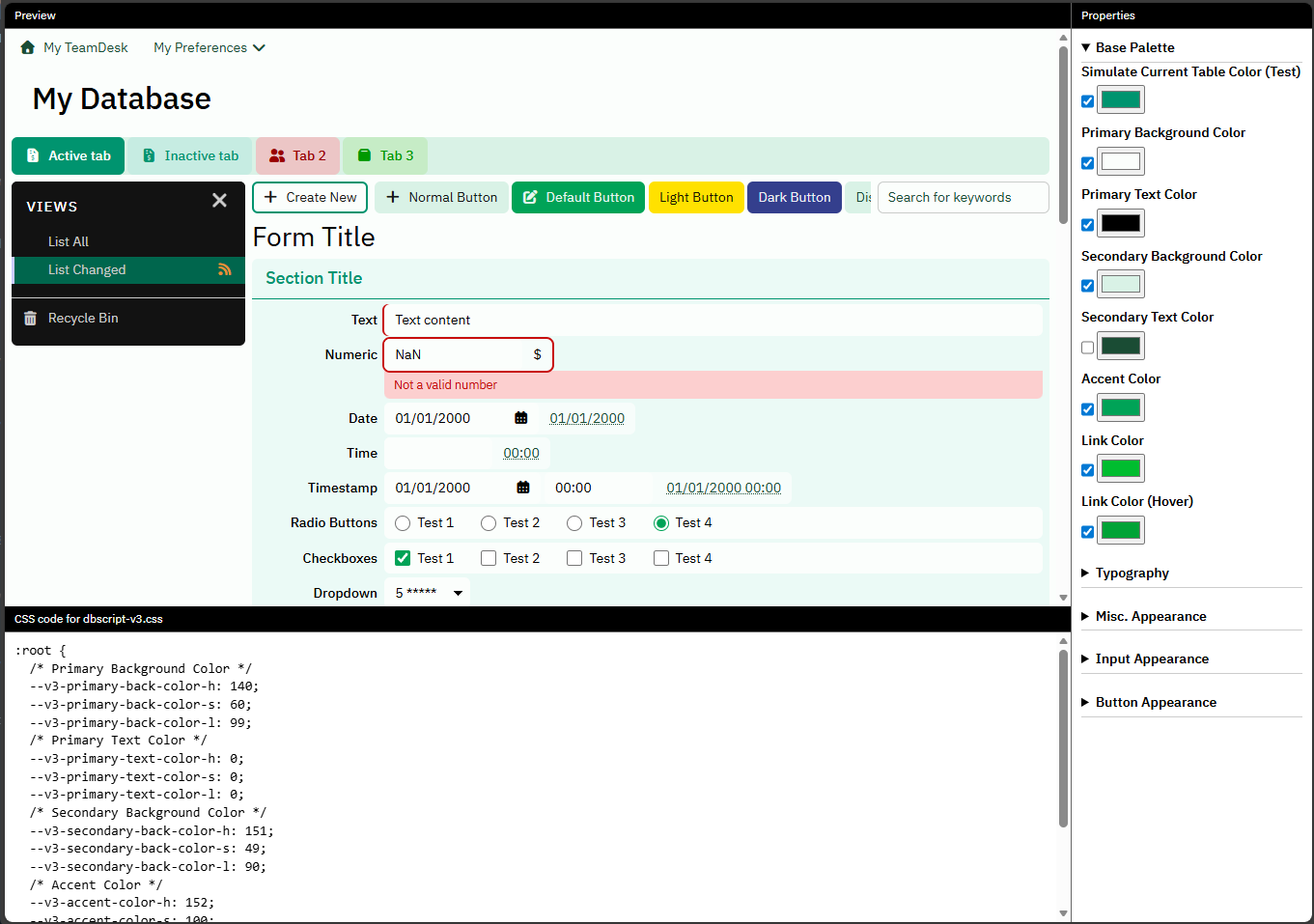
Left pane is an artifical TeamDesk UI containing all major interface elements.
Right pane provides editing facilities for all properties we covered in this article. Checkbox to the left of property editor allow quickly enable/disable the property, disabled property has no effect.
And in the bottom pane you’ll find CSS code for use in your stylesheet.
That’s all for today. Happly styling!


