Kanban
The Kanban View displays visual stages of a work process using cards to represent work records and columns to represent each stage of the process.
Let’s consider the Pizzeria database with the following Kanban view example:

The core setting of the Kanban view is the "Status" column that defines the list of columns to render in the view. The "Status" column should be a text column with a single-choice option or a lookup to such a column. Column’s colorization options, if provided, affect the color of the header. Also, the order of choices matters.

To create a Kanban View, select the Kanban option from the list of view types and click Next. The system will display the Kanban View form comprising the sections described below.
General Properties

- Name
- Enter a name for the new kanban view.
- Notes
- This field can hold any developer’s comments that need to be kept for this view. The comments will be visible in the Setup mode only.
- Show In Menu
- Leave this option checked if the view should be displayed in the menu.
- Category
- Enter a category name if you want to group the view under a category.
- Highlight Color
- Select a color to highlight this view in the list displayed in the menu.
- Icon
- This option allows you to select an icon for a view. You have a choice of 900+ icons covering various subjects – actions, brands, file types, symbols, animals, and more. The Search box above will help you narrow down the list of choices.

In the User mode the icon will appear to the left of the view name listed in the left menu of the table.
- Access
- If you want to restrict access to the view for your users based on their roles, select the
Restrict access right by rolecheckbox and choose which roles will have access to this particular view.
Matching Properties
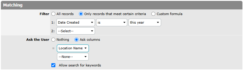
- Filter
- The
Matchingsection is intended to set the filter criteria for the records that will be displayed in the view.- All records: select if you want to include all records in the view;
- Only records that meet certain criteria: select if you want to filter records according to certain criteria. With the help of drop-down lists below create the rules according to which records will be filtered;
- Custom formula: select if you want to enter a custom formula and add the formula to the expanded field.
- Ask the User
- This filter option prompts the user to specify a value each time the view is accessed, allowing dynamic filtering based on their input.
- Nothing: option is disabled;
- Ask columns: the selected columns determine which fields the user will provide values for when applying the dynamic filter.
- Allow search for keywords: enables users to search within the column using keywords, making it easier to find specific records.
Grouping Properties

- Grouping
- In this section, specify the field whose values will form columns in the output and another field whose values will form rows. In our example, Students form rows while Dates grouped by month form columns. Grouping options are expounded in the Grouping item.
Sorting Properties

- Sorting
- This section is intended to set the sorting order for the records in this view.
- Default sorting: select if you want to sort records by default settings. Moreover, there is the
Edit Default Sortingbutton allowing you to change the sorting of the Default View. - Custom sorting: select if you want to set a specific sorting order. Use the expanded drop-down lists to define sorting criteria and order.
- Default sorting: select if you want to sort records by default settings. Moreover, there is the
Columns To Display
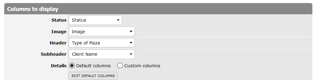
- Status
- A column chosen in the
Statusfield is very important in theKanbanview. It defines the list of columns to render in the view. The chosen column should be a text column with a single-choice option or a lookup to such a column. In our example, the text column with the name “Status” is chosen in theStatusfield. - Image
- In this field specify the column where the images are stored.
- Header
- Select the column comprising data that will be displayed as a header.
- Subheader
- Select the column comprising data that will be displayed as a subheader.
- Details
- Select which columns’ data will be displayed as details under the subheader.
- Default columns: select if you want to use the default set of columns. In this case, the Edit Default Columns button will be displayed. It allows selecting and reordering columns of the Default View.
- Custom columns: select if you want to use a specific set of columns for the new view. The system will expand a form to select the necessary columns. In the
Search Available Columnsfield type-in a column name and select this column in the field below. After that clickAdd(Tip: Hold CTRL to select multiple columns or deselect a selection). Use the group of buttons to the right of the form to change the order of columns in the view.
Advanced Options
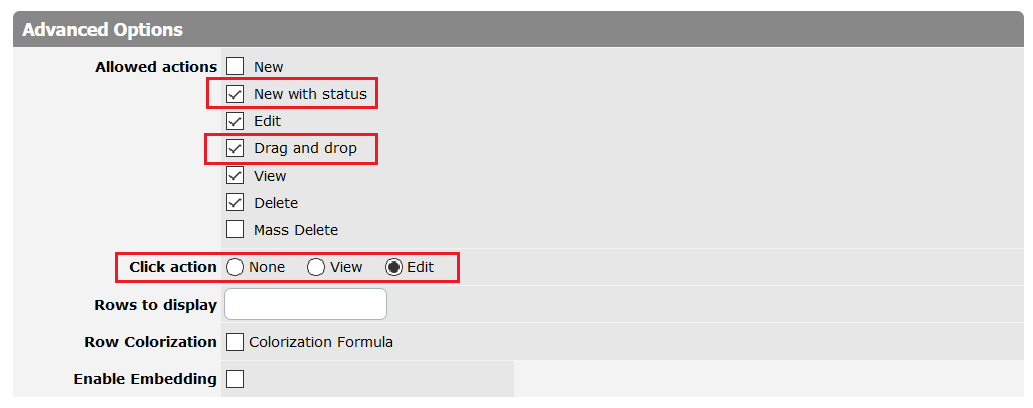
The Advanced options section is intended to specify additional options:
- Allowed actions
- The following options are available:
- New;
- New with status;
- Edit;
- Drag and drop;
- View;
- Delete;
- Mass Delete.
All record’s actions are hidden beside the ⋮ (three vertical dots) menu button.

Small "+" buttons in the table header allow a user to add a record with a pre-selected status. This option is controlled via the New with status checkbox.
Cards are draggable. To allow drag and drop, simply enable the Drag and drop checkbox in the Allowed actions section. Please note that dragging a record will change the value of the Status column. It’s not possible to change the card order with drag and drop; the order will always be determined by the Sorting property.
The reason for the New with status and Drag and drop extra options is that not all types of workflow allow arbitrary status setting. Some workflows require starting from the beginning. Even for the demo Pizza database, you probably should not put the pizza in the oven without preparing it first. Or moving from status to status may require filling in some fields.
When a Kanban view is placed on a table dashboard, its New with status and Drag and drop options are controlled via New and Edit options accessible in the dashboard section settings, respectively.
If you plan to delete many records at a time, use the Mass Delete option. As with other mass-actions, when the Mass Delete is checked, TeamDesk renders the Delete button in a view’s header and checkboxes to mark the records.
- Click action
- This option allows enabling quick navigation and controlling what happens when the user clicks on a card.
- If the View option is chosen, the user will be navigated to the record view form.
- In case the Edit option is selected, the user will be navigated to the record edit form.
- Rows to display
- In this field, you can specify the number of rows that will be shown in the view (use whole numbers only).
- Row Colorization
- If you want to highlight certain cards, select the
Colorization Formulacheckbox and enter the formula into the expanded field. The details are expounded in the View Colorization item. - Enable Embedding
- This option allows you to copy/paste a simple HTML snippet to embed a view on your website page. More details are described here Embedding Option for Views.

- Help
- When this text property is filled in, a view page displays a small dropdown titled "Help" just under the tab bar. When the user clicks it, it extends downward, displaying the text you’ve entered. Help text is formatted using markdown.
When finished, click Save to create a new view; click Cancel to discard changes.